
Writings
- NEW WORKS FOR 2023
- HEALING ARTSLETTER
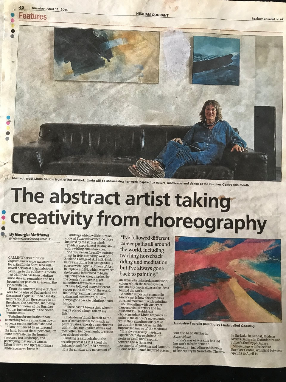
- THE ABSTRACT ARTIST TAKING CREATIVITY FROM CHOREOGRAPHY: ARTICLE IN THE HEXHAM COURANT
- ART IN THE NEW HEXHAM HOSPITAL PROJECT
- THE EFFECT OF THE COLOUR ELEMENT
- THE COMMUNICATIONAL IMPACT OF PAINTING
- 'PAINTING FOR WELL-BEING'
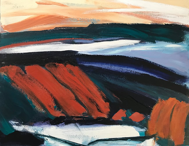
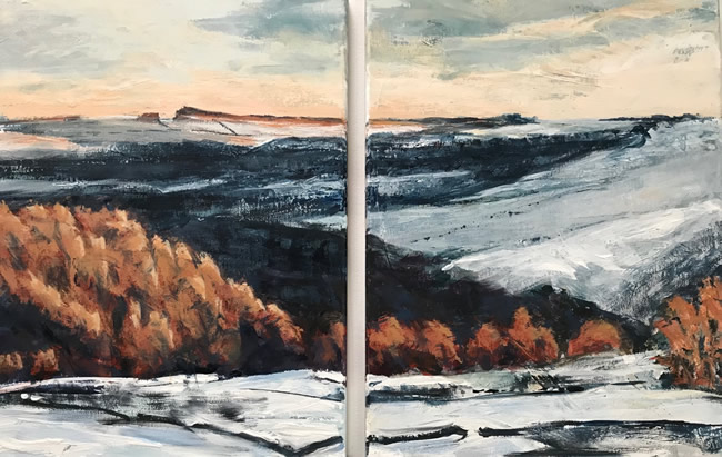
Having acutely felt the ‘loss of time’ during Covid, I have this year found a renewed energy which has poured – often literally – into my painting practice. Abstract work has still been my main focus but I have also explored figurative work with great interest. Below are examples of this – two approaches to the same place – in this case the Staward Gorge.
Travels with friends in the Valais area of Switzerland last year has also been a great inspiration for slightly more figurative works. These can be seen in the Main Portfolio on this website.
See details on the home page for an upcoming exhibition of these new works – May 6 and 7.
FROM WRITINGS ABOUT ART IN THE NEW HEXHAM HOSPITAL PROJECT – CHRIS DORSETT Prof. of Fine Art Northumbria University 2003
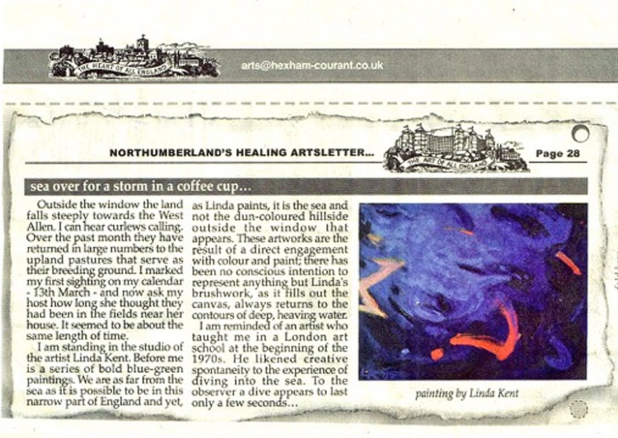
Outside the window the land falls steeply to the West Allen. I can hear curlews calling. Over the past month they have returned in large numbers to the upland pastures that serve as their breeding ground. I marked my first sighting on my calendar – March 13 – and now ask my host how long she thought they had been in the fields near her house. It seemed to be about the same length of time.
I am standing in the studio of the artist Linda Kent. Before me is a series of bold blue-green paintings. We are as far from the sea as it is possible to be in this narrow part of England and yet, as Linda paints, it is the sea and not the dun-coloured hillside that appears. These artworks are the result of a direct engagement with colour and paint; there has been no conscious intention to represent anything but Linda’s brushwork, as it fills out the canvas, always returns to the contours of deep, heaving water.
I am reminded of an artist who taught me in a London art school at the beginning of the 1970’s. He likened creative spontaneity to the experience of diving into the sea. To the observer a dive appears to last only a few seconds, but for the diver an eternity can unfold before you hit the water.
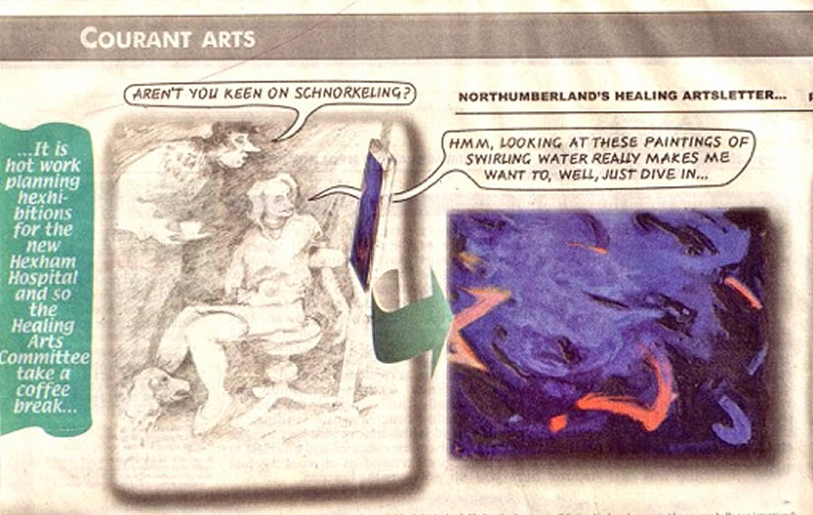
“There is so much time”, he used to say, “between one brush stroke and another”.
His idea was that artists should escape the mechanical restraints of clocks. A good abstract painting will look rather spur of the moment but the ‘creative time’ in which the artist works, the duration experienced within the artist’s head, is entirely elastic. A memorable feature of his diver’s approach to teaching was that paintings were always viewed on their side or upside down. His students were asked to imagine themselves spinning through the pictorial space they had created. There was no right way up, just a headlong plunge into the picture plane. I asked Linda if water is a good exhibition For Hexham Hospital. She responded enthusiastically and told me that the quality of life in Northumberland is greatly enhanced by the two seas that frame the region. Around here you do not have to go far to experience the power of tidal water. It may be more exhilarating than therapeutic but coastal colours and shapes let your imagination float free; you drift between warm and cool shades and curving and angular forms. This is just the kind of water theme we need at Hexham Hospital.
A curlew parachutes past the window towards a rough-pasture landing. At this time of year they forsake the estuaries and mudflats to remind us what lies just over the horizon.
THE EFFECT OF THE COLOUR ELEMENT Excerpt MA paper 2003
The starting point is the study of colour and its effect on men.
Wassily Kandinsky, Concerning the Spiritual in Art (1912)
Colour is fundamental to our lives, wherever there is light thre is colour, and it holds a strong attraction for us. It is at the same time an illusive yet powerful phenomena. Colour has the potential for strongly effecting us emotionally, psychologically, physiologically and spiritually. Quite how is difficult to define because nothing about colour can be totally pinned down – its illusiveness is one of its great attractions. And it effects different people in different ways. However, there does seem to be some universally acknowledged understanding of the effects of colour, and theories of how they work together.
Those for whom colour is a major tool in their work – visual artists, designers of buildings, interiors, gardens, stage sets, fashion, advertisements and so on, have to take these principles and effects of colour into account. They need to understand for example how, on a purely visual level, some deep blues and purples tend to recede – and as a result draw people toward them, while while some bright reds and yellows tend to advance – and as a result repel people from them: but that bright blues – cerrulean for example could advance while very deep reds could recede. This highlight s the facts that the basic rules about colour can be broken and often to great advantage in painting especially. One can for example make even a bright yellow recede – say if it next to a clean white or behind a darker colour. This latter creates and interesting tension where the held back yellow would be trying to come forward on the pictorial plane whilst pushing the darker colour forward.
The important thing to remember here is that the existence of the rules and theories of colour are guidelines which need to be thoroughly understood before they can be ‘broken’, extended or manipulated. This is where using colour becomes particularly fascinating.
In psychological terms, most would agree that reds, oranges and yellows tend to be warm and exciting , while greens, blues and purples tend to be cool and settling. This however is a simplification : colourists are aware that there are ‘warm’ blues and greens and ‘cool’ reds and yellows. For this reason, colour tests which ask individuals for colour preferences out of a limited colour chart tend to be inadequate for establishing a full ‘picture’ of the subjects character type. This is because people respond to and are attracted by particular hues or saturations of colours. For example one could be attracted to cobalt blue but less so to indigo blue.
The swiss psychologist Max Luscher (b. 1925) created his Colour Test in 1947 exploring the relationship between colour preference and character types, using seventy three colours initially. He was subsequently able to simplify this test using only eight colours. This simplified test is recognised and applied successfully in areas such as medical diagnosis and therapy, marriage guidance and personnel selection. One can deduce that its success is due to a highly particularised selection of the hues of those eight colours, based on his research and discoveries when using the original seventy three colour test. Luscher found that blue is the favourite colour among Europeans. Famously – Kandinsky (1866 – 1944) ranked among these. In his book ‘Concerning the Spiritual in Art’ he wrote:
The inclination of blue towards depth – is so great that it becomes more intense the darker the tone, and has a more characteristic inner effect. The deeper the blue becomes, the more strongly it calls man towards the infinite, awakening in him a desire for the oure and finally, for the supernatural …. Blue is the typical heavenly colour. Blue unfolds in its lowest depths the element of tranquility. As it deepens towards black, it assumes of a super human sorrow. It becomes like an infinite self-absorption into that profound state of seriousness which has, and can have, no end. As it tends towards the bright [tones], to which blue is however, less suited, it takes on a more indifferent character and appears to the spactator remote and impersonal, like the high pale blue sky. The brighter it becomes, the more it loses its sound, until it turns into silent stillness and becomes white.
This seriouse, intensely analytical approach to colour and its meaning typifies the thinking in Germany and other parts of Northern Europe, amongst the avant-guard artists and thinkers in the 1920’s. It reflects how cultural and historical influences strongly effect the way we perceive and understnd colour and its effects.
Part of this cultural influence is due to climatic conditions. These can strongly pre-dispose our preferences for and responses to colour………………….
THE COMMUNICATIONAL IMPACT OF PAINTING Excerpt MA paper 2003
Seeing comes before words. The child looks and recognises before it can speak.
But there also is another sense in which seeing comes before words. It is seeing which establishes our place in the surrounding world: we explain that place with words, but words can never undo the fact that we are surrounded by it.
John Berger Ways of Seeing (1972)
Painting has been recognised throughout history as a potent means of communication – perhaps most commonly before the majority of the society became literate, when epeople had no trouble relating to and understanding and indeed interpreting its literary content.
The physical elements of painting which include: colour, form, space, texture, tone (and the balance of these) which make up its visual language effect us primarily through our sense of sight. It is through our senses that we meet the world. What we experience with our senses effects us at a more fundamental or primary level than what we experience with our literal mind. In this sense painting is very closely related to music.
So the first impact of painting effects us on the sensual and non-literal or pre-narrative levl of our consciousness, the level at which thoughts start manifesting but have not formed into words – an informed sense of something – – – This is the level at which intuition functions: somewhere between instinct and intellect. Every painter to some degree must function on this intuitive level. (Incredibly this has been much maligned and mistrusted in postmodernist thinking). We should not overlook the fact that intuition is strongly informed by knowledge and the wisdom of experience. The process of painting, certainly for myself (and I’m sure for many), is a compelling balancing act between intellect and intuition in the way one uses or juggles all of the different elements of painting.
Throughout my adult life I have looked, with increasing fascination and sense of connection, at many paintings – by students at BA shows to world class painters, and read many books about their work. I have found evidence almost everywhere I have looked that the single most compelling element in paintingfor artists and those who write about painting is COLOUR.
Colour has the most immediate, powerful and arguably the most lasting effect on the viewer. For this reason, I have chosen to focus on this element in most detail.
PAINTING FOR WELL-BEING MA paper Linda Kent 2003
This MA project had two major strands – the painting and the research which very much informed each other.
INTRODUCTION
Over the past couple of decades there has been a vibrant and increasing wave of interest and recognition of the value of the arts in the healing process and its consequent use in hospitals and other healthcare environments.
The purpose of this paper is to investigate how paintings in particular can positively effect the viewer’s state of health and well-being with an emphasis on its use in enhancing the hospital environment….
The context is my participation in the 2003 project at the new Hexham Hospital – headed by the curator and Professor of Fine Art, Chris Dorsett – to establish a practice for setting up art exhibitions within the hospital complex.
It was decided well before the building of the hospital building was completed that visual art would be used as a major element in creating a welcoming and uplifting environment for both domestic and medical staff as well as for patients and visitors.
The theme for the pilot exhibition is WATER – historically and universally recognised as a valuable element in healing.
I am one of the two painters initially invited to make work for this exhibition which would celebrate the opening of the hospital in October 2003….
The project excited my developing interest in what makes a painting work with a particular emphasis on what can make it uplifting for the viewer….
This approach is currently being practised in many modern healthcare settings, with ‘art in healthcare’ organisations being set up to cope with this….